Search This Website

Sunday, 28 January 2018

Rainbow Six: Siege Event Introduces Loot Boxes

Image result for Rainbow Six: Siege event introduces loot boxes, $20 price increase


Rainbow Six: Siege developer Ubisoft recently announced the game’s next big event, “Outbreak,” kicking off in the spring. However, this event, which has players teaming up to battle a mysterious infestation in a quarantined town, also comes with several controversial changes that have left the game’s community upset and frustrated. Namely, the addition of cosmetic loot boxes, and a price increase for new players.

The Outbreak event is expected to have players fighting against zombies, and will be open to everyone during its four-week duration. Also being introduced are Outbreak Packs, which are loot boxes containing one of 50 new cosmetic items. Ubisoft says players will be able to earn four free packs during the event, but otherwise they’ll cost 300 R6 Credits, or $2.50 each. Fortunately it’s guaranteed that there will be no duplicates, so acquiring 50 packs will grant all 50 unique items.

Rainbow Six: Siege‘s other big change equates to a $20 price increase for new copies of the game, which is a lot for a title that was released just over two years ago. A $15 Starter Edition will remain available, albeit only on PC. Starting February 13th, the existing $40 Standard Edition for PS4, Xbox One, and PC is going away, and in its place is a new $60 Advanced Edition, which will include 10 Outbreak Packs and 600 R6 Credits (a value of $30 if purchased separately). Similarly, the Gold Edition (which includes the Year 3 content pass) is increasing from $70 to $90, while the Complete Edition (includes Year 1 and 2 content) rises from $110 to $130.


These two changes have many players upset, although not for the exact same reason. On the game’s subreddit, some are complaining about the fact that new players now have to spend $60 on a two-year old game, and that they’re forced to spend $20 extra on cosmetics they may not be interested in. Seeing as how the $40, cosmetic-free option is no longer available, it makes it harder to get friends to buy the game and join the fun when it was offered for $20 cheaper until recently.

On the other hand, longterm Rainbow Six: Siege players feel they’re being cheated, as new players can get 10 additional Outbreak Packs, whereas those who’ve been with the game for some time are forced to spend money for more packs. Both sides have valid frustration on the issues, and it seems Ubisoft hasn’t quite hit the middle ground to keep everyone happy. We’ll have to see if the developer uses the coming weeks to make things right.

SOURCE Ubisoft

Facebook announces game streaming program to rival Twitch, YouTube

Facebook announces game streaming program to rival Twitch, YouTube


Over the last few years we’ve seen Facebook heavily lean into video with features for live streaming and content creation, and now the social network is expanding its reach into gaming-focused videos. This is an area dominated by Twitch, YouTube, and, to a lesser extent, Microsoft’s Mixer, but Facebook has announced its new “gaming creator pilot program” as part of an effort lure streamers to the network, and in turn build up an audience for them.

Facebook says its new program will focus on live game streaming, and provide creators with tools to build and manage their communities. For example, streamers in the program will be able to broadcast their gameplay in 1080p at 60 frames per second, widely considered the gold standard of resolution for games.

It’s clear this is Facebook’s attempt to build something akin to Twitch’s “partner program,” which allows the most popular streamers to take advantage of features like monthly viewer subscriptions and exclusives for said subscribers, including private chat. Facebook says it’s program will include a tipping system that allows to viewers to give creators a $3 minimum tip, although it has yet to develop any exclusives for these paying fans.

Other details are still slim at this point, including how creators will split their revenue with Facebook, but the program will officially open on Sunday, with the social network inviting “dozens” of the biggest creators to join. Down the line, more streamers will be able to join as the company continues to develop the program.

Saturday, 27 January 2018

Paragon will shut down in April: Epic Games offers Refund

Paragon will shut down in April: Epic Games offers refund

The game Paragon from Epic Games will be shut down in April, the company has announced. All development on the game will stop and the servers will shut down. It’s disappointing news for fans, but the company is promising a refund for anyone who has ever made a purchase in the game. Why the closure? Because Paragon has failed where Fortnite has excelled.

Paragon is available for free on PC and PlayStation 4, and while it’s not exactly unpopular, it doesn’t enjoy the same massive attention that Fortnite is currently getting. In a post on its Paragon forums yesterday, Epic Games offered an update on Paragon’s future, saying that “with heavy hearts we’ve decided to close down” the game.

That closure will take place on April 26. “We truly appreciate everything you’ve put into Paragon,” the company said to players. “We received many passionate ideas for where to take the game; the outpouring of thoughtful suggestions is another testament to this incredible community.”

The reason for the closure, according to the company, is the lack of a “clear path” that will result in enough players to turn Paragon into a sustainable MOBA. “We have failed you — despite the team’s incredibly hard work — and we’re sorry,” Epic Games said.

The company warns that the number of players will continue decreasing over coming months, and so those who stick around until the end will have increasing trouble with matchmaking times and similar. To get the refund, PS4 owners should link their Epic account to the game; PC players can request their refund here.

Friday, 26 January 2018

1More Triple Driver In-Ear Headphones Review

Image result for Triple Driver In-Ear Headphones Review

The 1More Triple Driver In-Ear is priced at Rs. 8,999


1More has established itself as a serious contender in the audio space over the years. Its product portfolio isn’t very vast, but the few products we’ve tested have turned out to be really good. Today, we’ll be testing 1More’s highly acclaimed Triple Driver In-Ear, which is currently one of its most expensive offerings in India. This pair of headphones boasts of having three different drivers inside each earbud for higher fidelity audio.

The price tag of Rs. 8,999 puts it in the premium segment as far as wired headphones go. It's time to put the Triple Drive In-Ear to the test to see if the hype if real.

1More Triple Driver In-Ear design and features

The headphones look great and are snugly packed in a rather large box. The cable is sufficiently long (1.25m), and according to 1More, is made of an enamelled copper wire with kevlar fibre for increased durability and strength. The soft rubber lining of the cord is exposed from the Y-splitter to the earbuds, while the lower portion has nylon braiding.

The casings of the earbuds are made of metal and sit at slight angles when you wear them so they rest more comfortably in your ears. More than comfort though, 1More says this angle was chosen to increase sound isolation and improve quality. Inside each casing, there are two balanced armature drivers and one dynamic driver. The latter is said to use aerospace-grade material in its construction. Despite squeezing in three drivers, the Triple Driver In-Ear's casings are surprisingly compact and relatively inconspicuous when you wear them. We didn’t find them too heavy either. There is an in-line remote control, which houses the microphone for calls and three buttons for controlling music playback.

Image result for Triple Driver In-Ear Headphones Review


The 1More Triple Driver In-Ear boasts of an impressive frequency range of 20Hz to 40,000Hz, and an impedance rating of 32Ohms, which is decently low considering the number of drivers inside. 1More’s website claims that the Triple Driver In Ear is the world’s first pair of THX certified headphones. The headphones are available in black and titanium (which we have with us).

Coming to the packaging itself, it's pretty fancy and you get a couple of premium-looking accessories inside. On the flap of the box, we have some sketches of the process that went into designing the headphones, along with a message from Luca Bignardi, a Grammy-award-winning sound engineer who supposedly helped tune them. Flipping over the layer which has the headphones themselves, we have all the accessories which are boxed individually. The carrying case is a hard-shell box with a magnetic flap and a leather-like texture.

Next up, we have a dual-prong airplane adapter for using your headphones with in-flight entertainment systems. The same box also has a metal shirt clip for the cable. There’s a separate box just for the manual and a mini 1More product catalogue. Finally, the tallest box in the package houses the eight extra pairs of eartips that come in addition to the ones already on the earbuds. There are six sets of silicone tips in different sizes, and three sets of foam tips. All the accessories are high quality and feel premium.


1More Triple Driver In-Ear Headphones performance

We tested the 1More Triple Driver headphones on a range of devices including the LG V30+ , Apple iPhone 6s Plus , and a MacBook Air. We used an assortment of media ranging from online streaming to high-resolution FLAC files. We put the headphones through a short burn-in period too using 1More’s own Assistant app. Focus tracks for this review were In The Closet by Michael Jackson, Coming Back To Life by Pink Floyd, and Reminder by The Weeknd.

Image result for Triple Driver In-Ear Headphones Review

In The Closet is quite a complex track with a lot going on in the mid-range, along with heavy bass notes. With the FLAC version of this track, the Triple Driver In-Ear managed to deliver very good separation between the multiple instruments and the sound effects that are sprinkled intermittently throughout the song. Bass response was punchy and to the point. We were easily able to hear minute nuances, which would otherwise have been lost.


In Coming Back To Life, the electric guitar riff at the beginning sounded sharp and bold. Vocals were once again crisp and were placed front and centre among all the instruments. High frequencies were handled with precision thanks to the balanced armature drivers doing most of the heavy lifting, while the dynamic driver provided a subtle amount of bass throughout the track.


We chose Reminder mainly for its heavy bass, which sounded punchy and tight. There was good control here and we never found the bass overpowering the other notes or vocals at any point in the song, even with the volume turned all the way up.


Listening to the same tracks in FLAC using all our different test devices showed that the quality of the source really matters with the 1More Triple Driver In-Ear headphones. The quad DAC feature of the LG V30+ didn’t seem to make a significant difference to the audio quality, compared to listening to the same songs on a more budget-friendly smartphone such as the Samsung Galaxy On7 Prime. We did notice a small difference in the mid range, and the bass was a bit more controlled, for the most part, it was hard to distinguish them. Music streamed from the Internet sounded good too, but you won’t be doing the headphones justice unless you're streaming high-resolution files.


The silicone ear tips offer a good fit but we found the foam ones to be more comfortable, and they even offer better isolation against ambient noise. However, there is audio leakage at high volumes, and so whatever you're listening to will be audible to those around you. On the comfort scale, we didn’t have any issues with fatigue even after listening to music for over an hour.


Voice calls were handled well, and the buttons on the in-line remote have good tactile feedback. The headphones also do a good job with other forms of media such as movies, which sounded balanced and engaging in our experience.

Image result for Triple Driver In-Ear Headphones Review

Verdict
The Triple Driver In-Ear from 1More manages to live up to the hype surrounding it. This pair of headphones produces balanced and detailed sound. It's good with pretty much any genre of music thanks to the two balanced armature drivers tackling the high and mid-range frequencies, while the bass is left to the dynamic driver. Its market price of Rs. 8,999 is a bit on the high side when compared to the typical price in other countries, but isn't too bad in terms of value. This pair of headphones is easy to drive with any decent portable device thanks to the relatively low impedance rating. Build quality is also very good, and you get a lot of accessories in the box.

If you do spring for the 1More Triple Driver In-Ear, then rest assured, you won’t be disappointed. Just make sure you have some high-resolution audio sources to get the most out of it.
Price (MRP): Rs. 8,999
Pros 
  • Balanced sonic signature
  • Detailed highs and mids
  • Well built
  • Good bundle
Cons
  • Audio leakage at high volumes
Ratings (Out of 5)
  • Design: 4.5 
  • Performance: 4.5
  • Value for Money: 4
  • Overall: 4.5


Games with Gold for February 2018 list

Image result for Games with Gold for February 2018 list

That time of the month is once again upon us: Microsoft has revealed which games will be available to Xbox Live subscribers under its Games with Gold program. This time around we see a total of four games, two for the Xbox One console, as well as one for the Xbox 360 plus one an Arcade title. Which game is best among the group is debatable, but all of them are great options.

If you’re an Xbox One console owner, and assuming you have an Xbox Live Gold membership, you’ll be able to download the following two titles for free: Assassin’s Creed Chronicles India and Shadow Warrior. Together those games have a retail value of just under $40 combined, with Shadow Warrior being the pricier of the two.


Assassin’s Creed Chronicles India requires little introduction — it is one of many Assassin’s Creed titles, this one set in India. Shadow Warrior, meanwhile, puts players in the place of Lo Wang who is tasked with getting the legendary blade of “limitless power.” These games will be available to download from February 16 to March 15th.

For Xbox 360 owners, February 1 will bring a free download of Split/Second, which will remain available until February 15th (retail price: $19.99). Starting on February 16th, subscribers will get access to the Arcade title Crazy Taxi, which will be available until February 28th (retail price: $9.99).

Of course, Xbox One owners have access to the Xbox 360 games via Backward Compatibility. An Xbox Live Gold membership is available for $9.99/month for a single month, for $14.99 for three months, and 12 months for $59.99 USD.

Wednesday, 24 January 2018

Samsung Galaxy A8+ Review

Image result for Samsung Galaxy A8+ Review


Nearly a year after the first smartphones with 18:9 screensdebuted at MWC 2017, nearly every manufacturer has jumped on board. This kind of design started out as a novelty, quickly became trend, and is now pretty much a mainstay of smartphone design. It isn't any surprise, since this is the first time in a very long time that phones have looked any different, and people do feel like they're getting something better and more modern. Phones with 16:9 screens, (and heaven forbid, actual buttons on the front) do now seem old-fashioned.

Samsung gained an early lead with its Galaxy S8 and Galaxy S8+ at the beginning of last year (though it went with 18.5:9 which it calls "Infinity Display") and then released the Galaxy Note 8 six months later, but didn't seem think the rest of its range deserved the update. Meanwhile, its competitors were clambering over themselves to make sure they didn't fall behind the curve. Over this past year, we've seen dozens of new 18:9 phones launching across the price spectrum. The most notable example of that is OnePlus rushing to replace its barely five-month-old OnePlus 5 with the OnePlus 5T , just to make sure it didn't cede even the slightest ground to its competitors.

That makes today's review subject all the more interesting - the new Galaxy A8+ (2018) is Samsung's first non-flagship phone to be graced with an Infinity Display, and it's priced to go right up against the OnePlus 5T. Is Samsung too late to the party, or has it been worth the wait? We're about to find out.


Samsung Galaxy A8+ (2018) design

As its name suggests, this is one large phone. Samsung hasn't launched the smaller Galaxy A8 (2018) in India, which is a pity, because the A8+ (2018) can be a bit of a handful. It's relatively thick and heavy at 8.3mm and 191g. That weight also feels unbalanced, especially when typing, which requires you to hold the phone from close to the bottom. It will stick out of many pockets and generally make itself felt wherever you try to stash it.

Samsung has listed two colour options for this phone, black and gold. We had a black unit for review and with the removal of buttons from the front face, it looks really plain and monolithic. The front and back are both shiny glass, though only the back curves around the matte black metal frame. While some might like this look, others will prefer the gold version which has a black front face and camera module providing a bit of visual relief.

The front face is broken only by the earpiece and dual front cameras right near the upper edge. When the phone is on, Samsung's Always-On Display readout is splashed across the screen, taking advantage of the sAMOLED panel's ability to selectively light up pixels without consuming a lot of power. By default, there's a large clock, the date, the battery level, and four icons representing your most recent notifications. You can choose different clock styles and hide other information, or only enable the Always-On Display between hours of your choosing.

The power button is on the right, and the phone's single mono speaker is positioned right above it - an unusual position, but one that Samsung has been using on multiple models of late. On the left, there's a volume rocker and a tray for the primary Nano-SIM. The second Nano-SIM as well as a microSD card fit in another tray that slides into the top. There's also a USB Type-C port and a 3.5mm audio socket on the bottom. An advantage of the all-black look is that the antenna lines are barely visible.

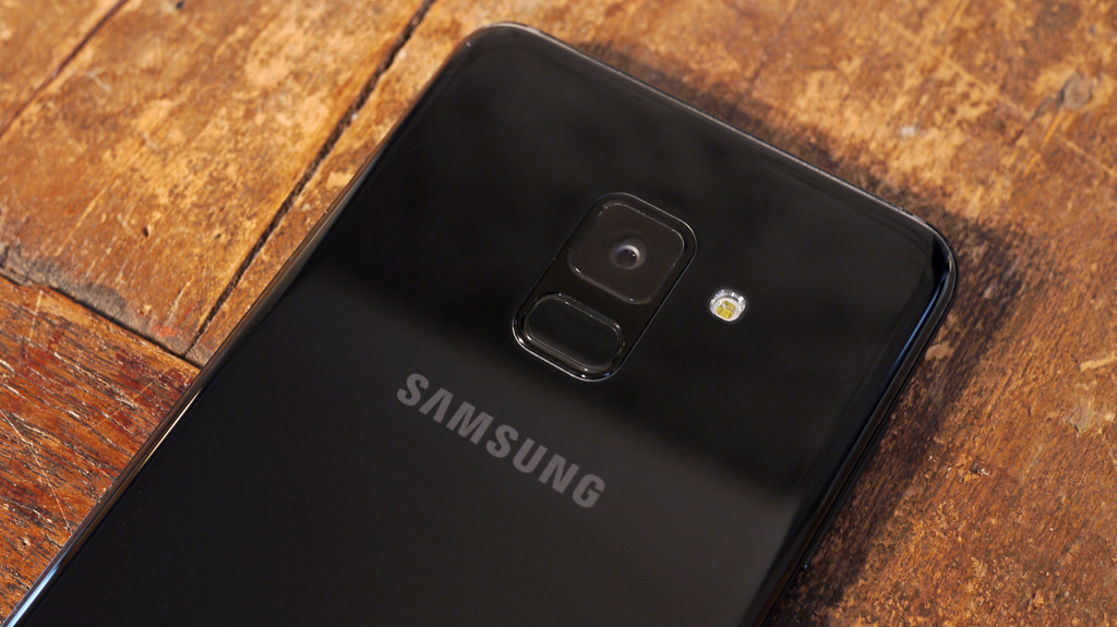
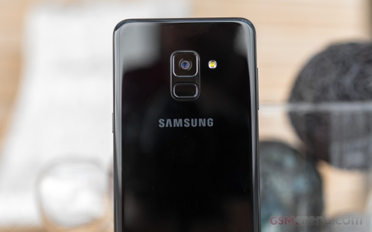
The primary camera is in the upper middle of the rear, with a single-LED flash to the side and small, rectangular fingerprint sensor right below it. Unusually for phones these days, the camera doesn't protrude at all. There's a surprisingly subtle Samsung logo lower down, and some barely visible regulatory text at the bottom.

One feature that we're always happy to have is weatherproofing, and the Galaxy A8+ (2018) is certified IP68 for water and dust resistance. The SIM trays are flanged with rubber to prevent ingress. However, there’s no mention of whether the display glass is reinforced, which is concerning.

Samsung's Galaxy A-series phones are meant to be more affordable versions of the current reigning S-series flagships, in this case the Galaxy S8 and Galaxy S8+. The Galaxy A8+ (2018) inherits many of their design cues, but it doesn't look quite as slick or refined. It's a bit too bulky and awkward to handle, and in fact it more closely resembles last year's Galaxy C9 Pro. In fact, with its pricing and specifications, it serves the same market. In terms of look and feel alone, it doesn't really stand out compared to the competing OnePlus 5T or Honor View 10 (Review) either.

Related image

Samsung Galaxy A8+ (2018) specifications and software

Samsung usually plays it conservatively with specs outside its flagship tier, but with this launch, it's hoping to take on upstarts like OnePlus and Honor. The Galaxy A+ (2018) uses Samsung's brand new Exynos 7885 SoC, which has two high-speed 2.2Ghz ARM Cortex-A73 cores and six supplementary 1.6GHz Cortex-A53 cores, plus an integrated ARM Mali-G71 GPU. There's 6GB of RAM, and the only Samsung phones to ship with so much before now have been the Galaxy Note 8 and the aforementioned Galaxy C9 Pro.

You get 64GB of storage, of which about 51GB is available to users. MicroSD card support goes up to 256GB. Because of Samsung's unique 18.5:9 aspect ratio, the screen resolution is 1080x2220, giving you a tiny bit more height than the 1080x2160 that you get at 18:9. It measures 6 inches diagonally but the corners are rounded for aesthetic purposes, so you lose a tiny bit of screen space.

The Galaxy A8+ (2018) also features dual-band Wi-Fi 802.11ac, Bluetooth 5, NFC, GPS, and 4G with VoLTE. There's a rich complement of sensors, including a barometer and gyroscope in addition to the standard ambient light and proximity sensors. The battery comes in at 3500mAh which is the least we'd expect for a phone this large. Fast charging is supported, but not wireless charging.

This phone and its smaller siblings are Samsung's first to feature dual front cameras. There's one with a 16-megapixel sensor and another with an 8-megapixel sensor, and both have f/1.9 apertures. The rear camera is a 16-megapixel unit with an f/1.7 aperture. Surprisingly, video recording tops out at 1920x1080. There's also no optical image stabilisation for any of the cameras.

Image result for Samsung Galaxy A8+ Review

Samsung ships the Galaxy A8+ (2018) with Android 7.1.1 which is disappointing in 2018. The Samsung Experience skin on top is beginning to get as bloated as the company's reviled TouchWiz UI from years past. At first boot, we were allowed to choose which Samsung apps we wanted installed. We were happy to ditch Samsung Email, Samsung Notes, and Samsung Internet Browser, but there was no way to know what exactly Samsung Connect and Samsung Members are. Samsung Voice Recorder and Samsung Pay are optional apps.

On the home screen, there's a giant My Galaxy widget showing off the phone's various features and advertising services such as ordering a meal or taxi and paying bills. You need to sign up with your phone number, but when we tried it we didn't receive the required one-time password by SMS for hours. You have to register for My Galaxy if you want to be able to find a phone service centre and book an appointment, or chat with tech support.

Samsung's Bixby voice assistant takes up a page to the left of the first home screen and requires you to create a Samsung account which is a separate process. Interestingly, the Galaxy A8+ doesn't get Bixby as a voice assistant - you only get reminders of your upcoming calendar appointments and panels for things like the weather and news. There's no Bixby key on the side of the phone, and long-pressing the Home button brings up Google Assistant (or S-Voice if you choose) so Bixby as a feature isn't the same as it has been advertised on Samsung's flagships.

There's more bloat around every corner - Samsung has tried to transform even the humble Contacts app into a social network with sharable status updates and profile pictures. The Samsung Gallery creates "stories" and multiple apps want you to use a "customisation service" which collects your stored contacts and tries to determine which people you are closest to, for undefined reasons. Opera Max and a bunch of Microsoft apps are preinstalled, and can only be disabled but not removed. The default system keyboard is customisable in many ways and supports transliteration into Hindi, Tamil, and Telugu which could actually be useful.

In the Settings app, you'll find options to manage the full-screen scaling for apps that can't handle it natively, the on-screen Android navigation buttons, fingerprint sensor gestures, a one-handed mode, "Dual Messenger" apps (cloning apps to allow you to use multiple accounts), Samsung Cloud syncing, and split-screen multitasking.

Image result for Samsung Galaxy A8+ Review

Samsung Galaxy A8+ (2018) performance, cameras, and battery life

The Galaxy A8+ (2018) has some powerful hardware and for the most part it runs without any problems. Large games load quickly, and the phone doesn't get too warm at any point. However, there were tiny hiccups on rare occasions, when we felt the UI behave a little sluggishly or touch input didn't seem to register. Hopefully, periodic software updates will iron these kinks out, because usage was otherwise perfectly fine.

Image result for Samsung Galaxy A8+ Review

Samsung's new mid-range processor is fairly powerful, and delivered scores of 78,359 in AnTuTu, 5,192 in PCMark Work 2.0, and 1,525 and 4,349 respectively in Geekbench's single-core and multi-core runs. 3DMark's Slingshot test gave us 1,069 points, and GFXBench's T-rex test ran at 31fps. We can definitely see that this phone isn't on the same level as the similarly priced OnePlus 5T and Honor View 10, but it should still be able to handle most apps and games without any problems.

The Infinity Display doesn't look quite as "infinite" on this phone as it does on Samsung's flagships, because instead of glass curving around the sides of the phone, there are still distinct edges. Even so, it's immersive and vibrant. Brightness isn't a problem even outdoors, and all kinds of content look pretty crisp and enjoyable. The odd placement of the speaker turned out to be a good thing, because it's hard to block when holding this phone in any orientation and it doesn't get muffled with the phone lying on soft surfaces. Sound is loud and voices are clear, but music comes out a bit too harsh for our liking.

One feature of the Galaxy A8+ (2018) that Samsung is promoting heavily is face recognition. This isn't the same as the iris recognition feature on Samsung's top-end phones, but is much more like what you'd get with the OnePlus 5T. In our experience, it just didn't work well, either failing completely or taking more than five seconds to unlock the phone every time we tried it. This was despite trying to enrol our faces multiple times to account for poor lighting or angles. There's an option to make recognition quicker by reducing the security threshold, which we obviously do not recommend.

The camera app has stickers (some of which are live and animated with sound), filters, and Bixby Vision for object and place recognition. It isn't immediately clear how you're supposed to switch between the two front cameras - there's a Live Focus mode shortcut right within the viewfinder which lets you take shots with background blur, and then there's a Wide Selfie mode in the hidden menu that you have to swipe right to see. In both cases, there doesn't seem to be much of a difference in the composition of frames when using the secondary camera. In Wide Selfie mode you still have to physically pan the phone from side to side, whereas some other phones have a wide-angle lens that just gives you a wider frame.

Image result for Samsung Galaxy A8+ Review

This might be Samsung's first phone with dual front cameras, but there really doesn't seem to be anything that really takes advantage of the second sensor. Live Focus gave us some fairly decent-looking results, and the phone lets you adjust the degree of background blur from the gallery app long after taking a shot. As far as the promise of low-light performance goes, we couldn't see much of a difference there either.

As for photos taken with the rear camera, results were a bit weak. If there was even lighting, the Galaxy A8+ (2018) managed well, though we would still have liked to see better handling of details and exposures. Objects at even a slight distance came out looking artificial, with noisy textures, rough edges, and overblown whites. At night, things took a drastic turn for the worse. If there wasn't a lot of artificial light falling directly on a subject, the phone could barely pick out any details whatsoever. Even on the phone's bright sAMOLED screen, it was clear that there was a ton of noise, and that you just couldn't see things even if you were standing right in front of them. We weren't expecting camera quality to be on par with that of the Galaxy S8, but this was totally disappointing.


Video recording only goes up to 1080p with the rear as well as front cameras. You can choose the slightly wider custom resolution of 2224x1080, which at least doesn't crop your frames in order to fill the screen, but Samsung decided not to make this the default selection. There is digital stabilisation but not optical.

Battery life was good overall, and we were able to get through a full day of normal usage with about 15 percent left over. Our HD video loop battery test ran for 12 hours, 52 minutes which is not too bad for a phone with a screen this size to light up. We found that the phone charged up to 50 percent in slightly over half an hour, which is also good. Wireless charging isn't supported, in case you were wondering.

Verdict

The Galaxy A8+ (2018) is in a bit of an awkward position. It isn't very convincing when seen next to the OnePlus 5T  and Honor View 10 , especially because of the features and capabilities that Samsung still reserves for its flagships. We don't think the new Galaxy A8+ it's strong enough to fend off the OnePlus 5T at exactly the same price. Camera quality is severely disappointing, and the implementation of dual front cameras just leaves us confused. Despite its Infinity Display, the phone's design doesn't really scream for attention. While the performance is good, it's let down by software bloat. On the other hand, high-quality AMOLED screen is great, and the battery life is excellent.

With that said, Samsung needs to figure out how to give its phones at this price level a strong identity and build on unique capabilities such as Samsung Pay, because the Galaxy A8+ (2018) definitely can't compete on specifications and cost. Right now, Samsung's own Galaxy S7 looks more attractive thanks to its lower price. The Galaxy S8 is also soon to be replaced, which means it will become more affordable as well.

Monday, 22 January 2018

Final Fantasy 14 Update Reintroduces Iconic FF6 Villains

Image result for Final Fantasy 14 update reintroduces iconic FF6 villains

The popularity and quality of Final Fantasy XIV has grown significantly since the release of the Stormblood expansion last year, and now developer Square Enix has detailed the online RPG’s latest update. Dubbed Rise of a New Sun, the new 4.2 update will be released on January 30th and include plenty of new content for players to explore. But what has series fans most excited is the tease of an iconic villain from Final Fantasy VI making a return.

Square Enix has released a trailer highlighting some of the new content and changes included in Rise of a New Sun, but it’s the very end that drops a nostalgia bombshell. The clip closes out with the grinning face and distinctive laugh of Kefka, the antagonist of FF6, which was first released on the SNES. The lunatic wizard is one of the most infamous villains of the Final Fantasy series, and one that longtime players are eager to see again.


FF14 has been using nostalgia to great effect lately, with the previous 4.1 update taking players back to the world of Ivalice, the setting for FF12 and Tactics. With the 4.2 update, it appears Square Enix is focusing on FF6: the older game’s Phantom Train dungeon boss is featured in the new trailer, and Kefka is expected to be the final boss of Stormblood‘s new raid, Omega: Sigmascape.

Along with Kefka and raid, Rise of a New Sun‘s other new features will include side quests, an updated hard version of the The Fractal Continuum dungeon, a new trial will players will face off against Byakko, one of the Four Lords, and changes to housing and PvP rules. The 4.2 update will be out on January 30th for both PS4 and PC versions of FF14.